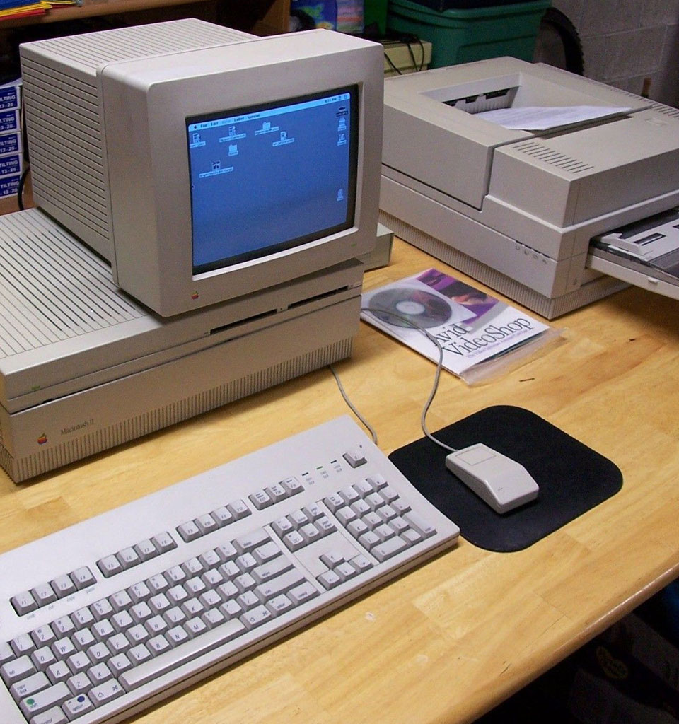
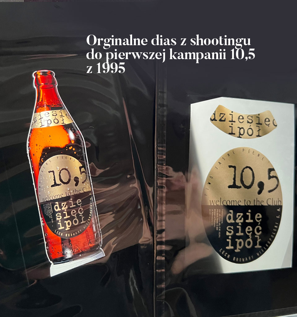
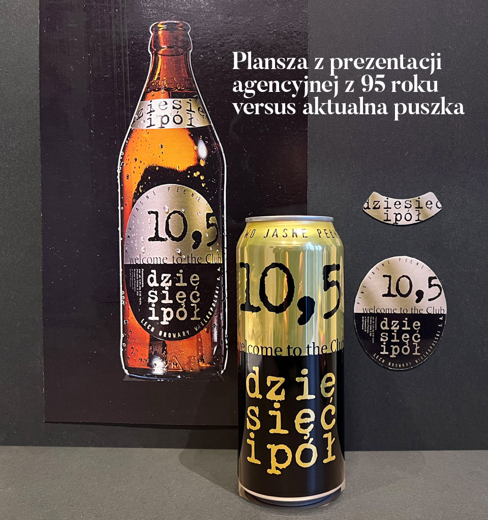
It was 1993; the Internet was just getting started, and Photoshop v. 2.5 was available on floppy disks. A 17-inch color monitor for a Mac cost about $8,000, and the average desktop hard drive had a capacity of 80 MB.
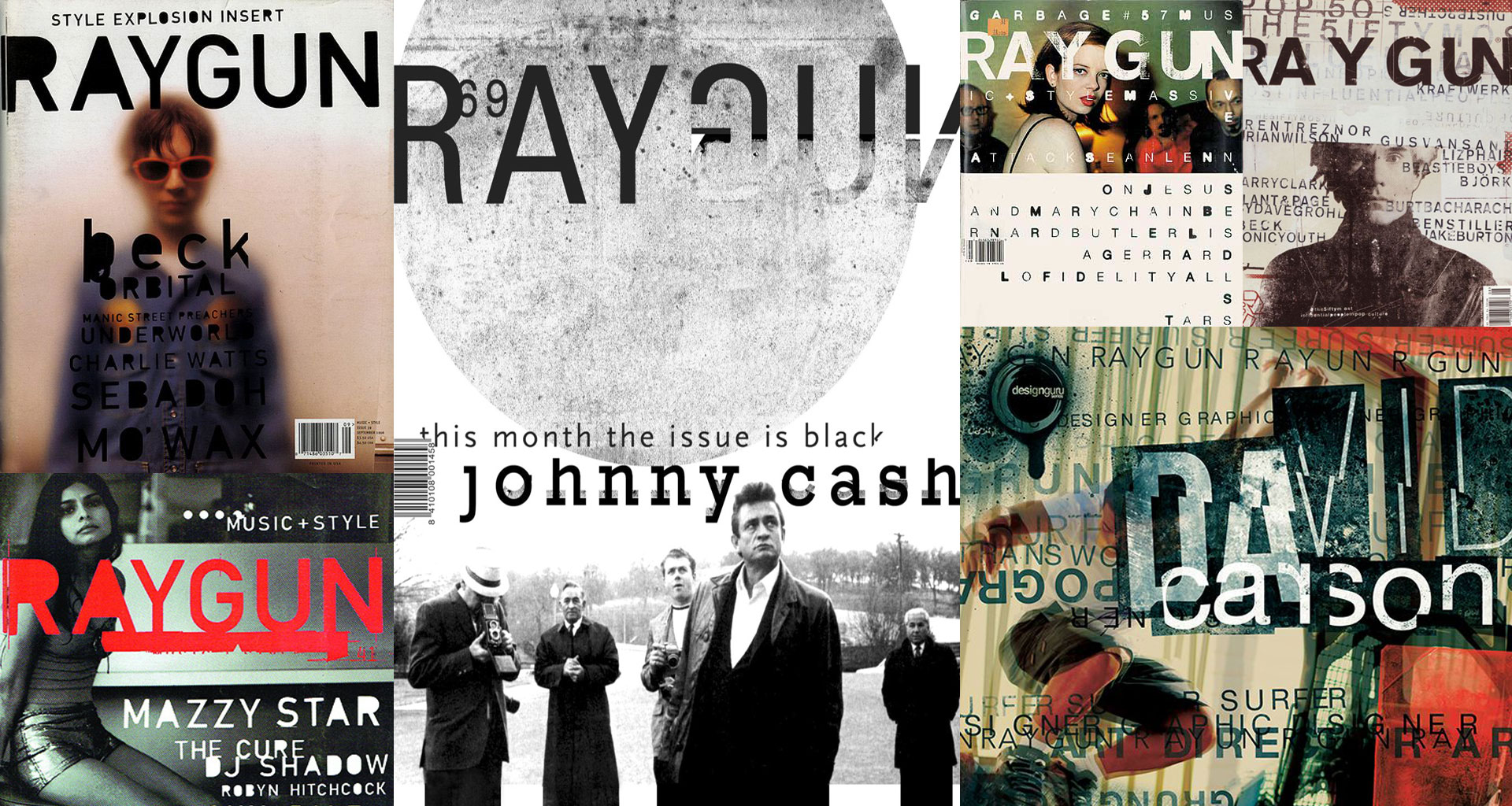
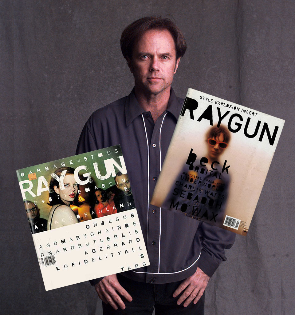
Grunge reigned supreme in music, as it did in design and typography. The bible and inspiration for all graphic designers who wanted to be “in” was the American monthly magazine RayGun, which had been published since 1991, and whose art director was David Carson – an absolute superstar and guru of graphic design at the time. He completely revolutionized typography by breaking all of its rules and taking lettering to a whole new level.
Exactly at that time, every new issue of RayGun, bought at the international press kiosk at Hamburg’s main train station, was feverishly passed from hand to hand in the creative department of the advertising agency JUST in Hamburg, where I worked as an art director. To be honest, we were all very jealous that these guys in California had the opportunity to do such fantastic things, while we were condemned to our conservative agency routine.
 Robert Neumann