Ortenika. Medical brand anatomy.
Brand visual identity / Typography / Packaging / Portfolio
DOZ S.A. is a leading pharmacy chain in Poland and one of the largest chains in Europe. It is also the owner of many private labels in the health and care category. The client’s plans included introducing a line of orthopedic and rehabilitation products under the Ortenika brand into the range. As a long-term partner, we undertook the task of creating a brand from scratch.
Our goal was to create the image and visual identification of the new brand and packaging concept. The target group was mainly the elderly, but the range of products also included physically active consumers (exposed to injuries and requiring support during convalescence).
The strategy included the expert nature of the brand and we wanted to address this message through the packaging design.
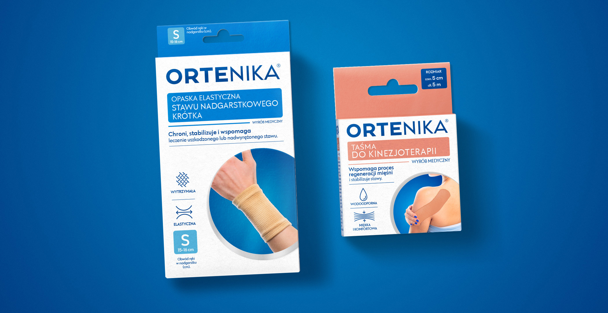
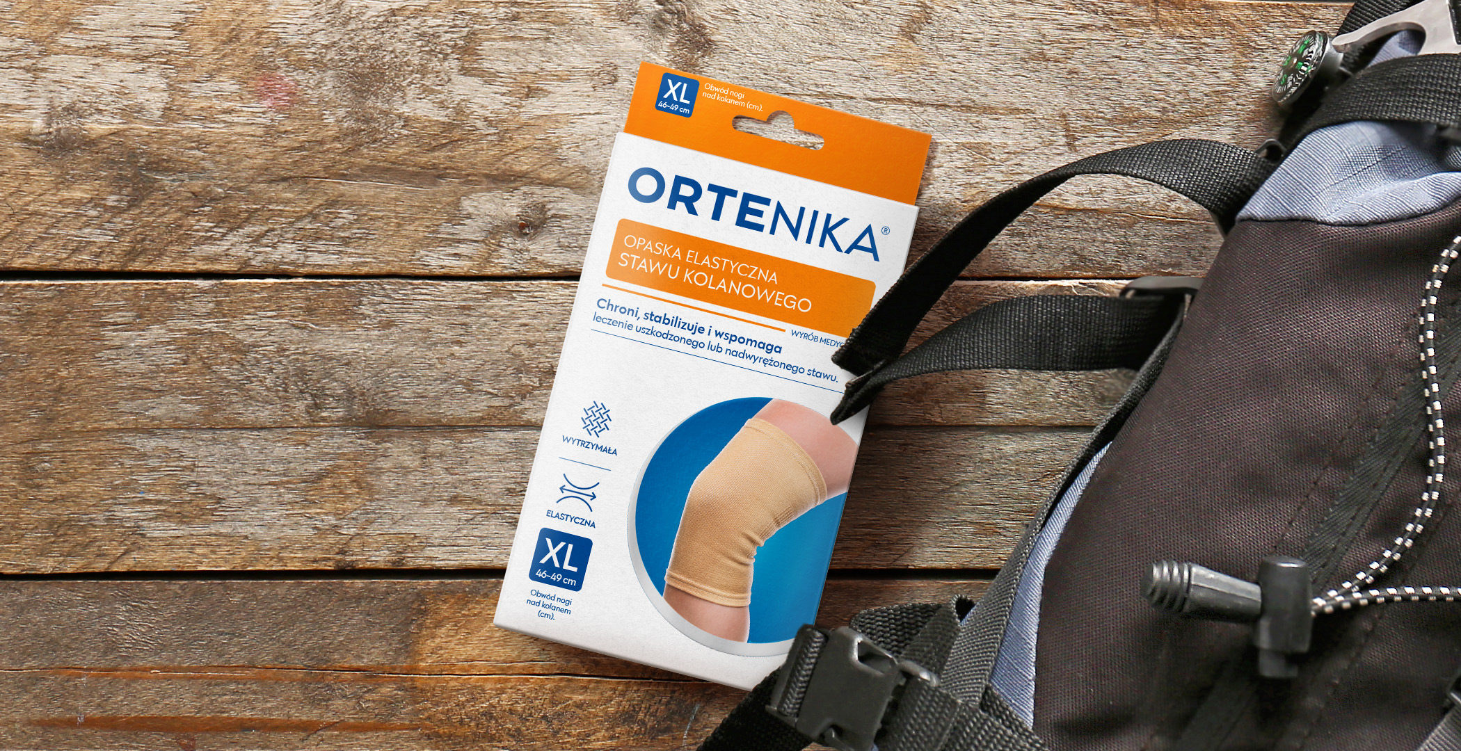
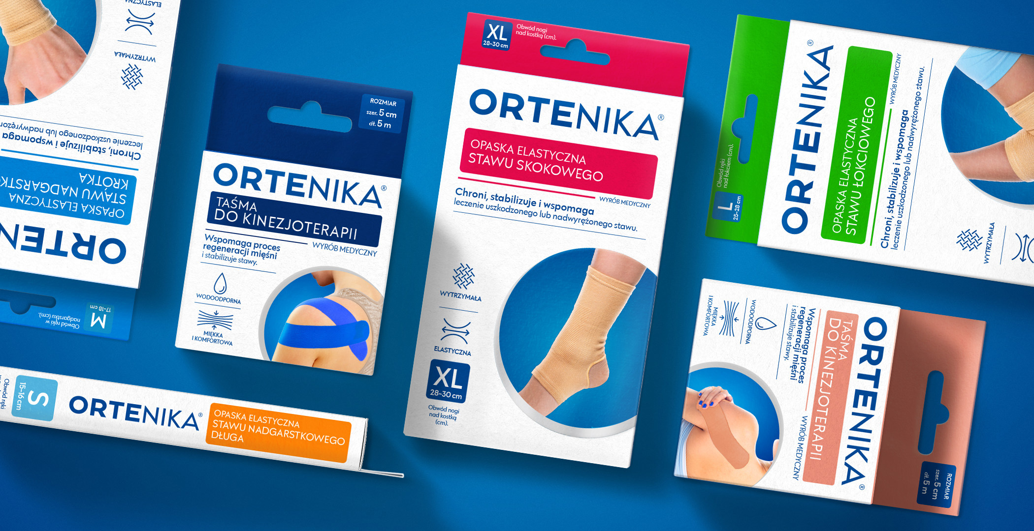
We have created a simple, legible logotype that covers the entire width of the package. We wanted the brand to be noticeable on the shelf and build the image of an expert from the very beginning. We focused on a minimalist form of layout with a clear distinction of variants. The size symbol was a very important element. It appears several times on the packaging in places visible to the consumer. The icon system and content narrative clearly communicates destiny and benefits. The whole is complemented by a realistic illustration of the product with its colours and an example of usage. The professional and medical character of the brand is also emphasised by the refinement of the print – a silver hot stamp on the front of the packaging.