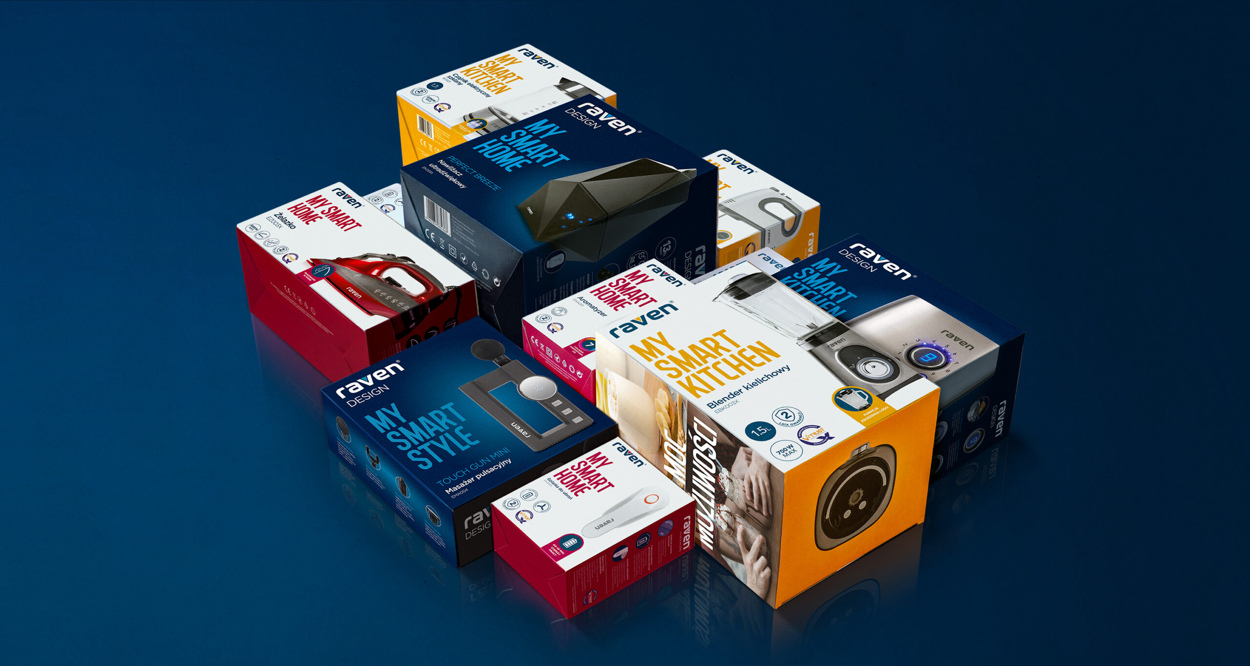
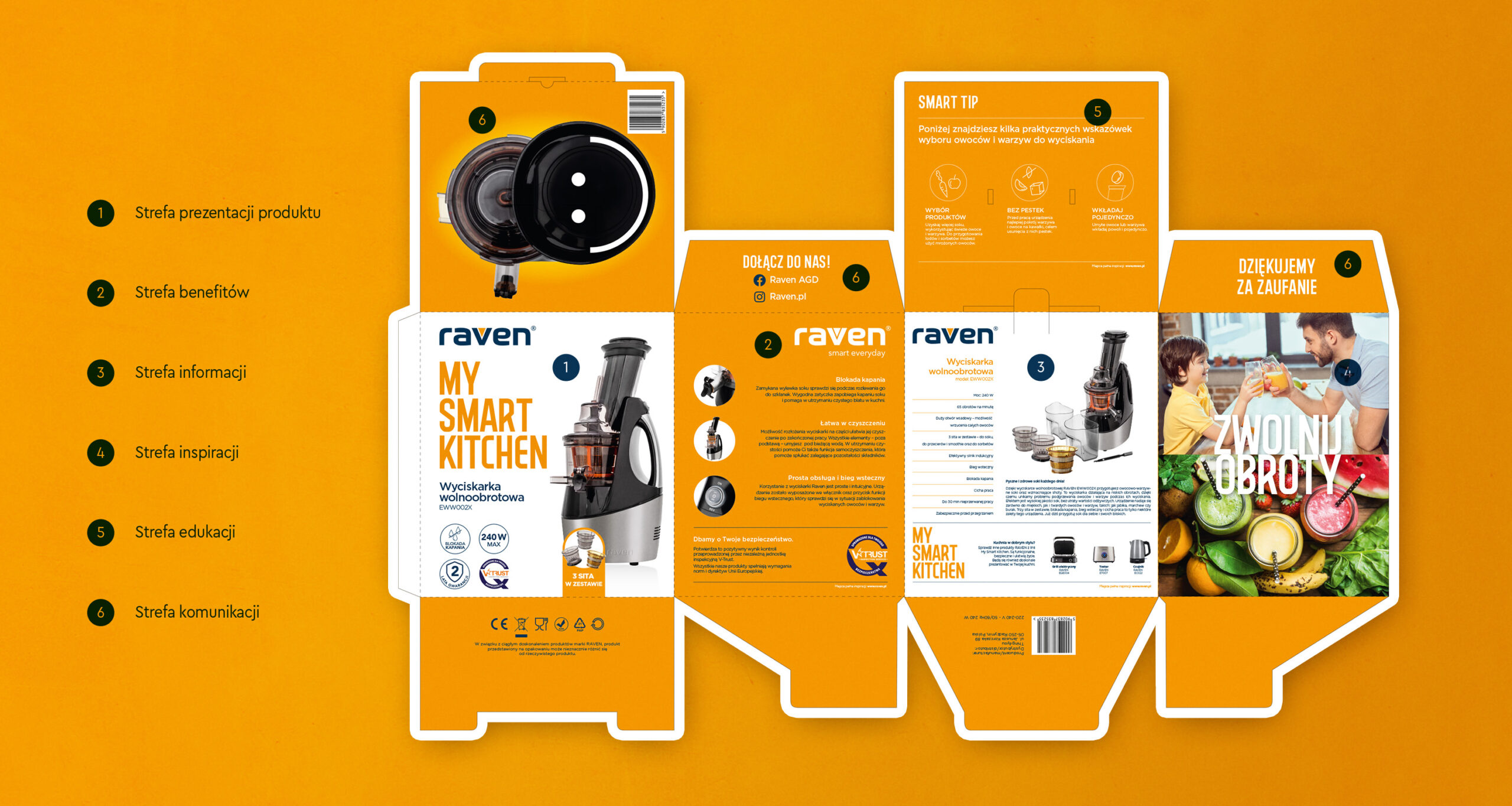
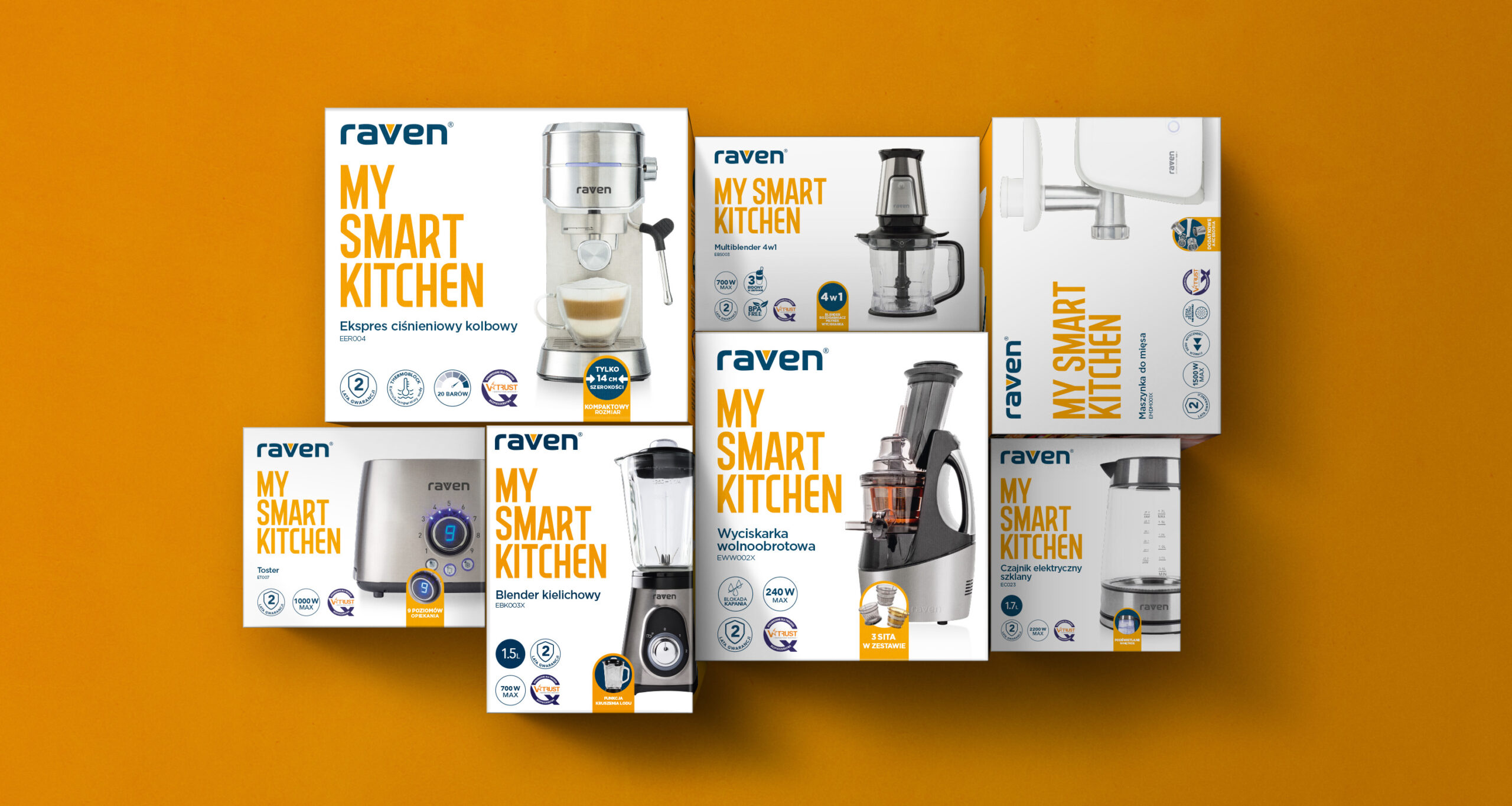
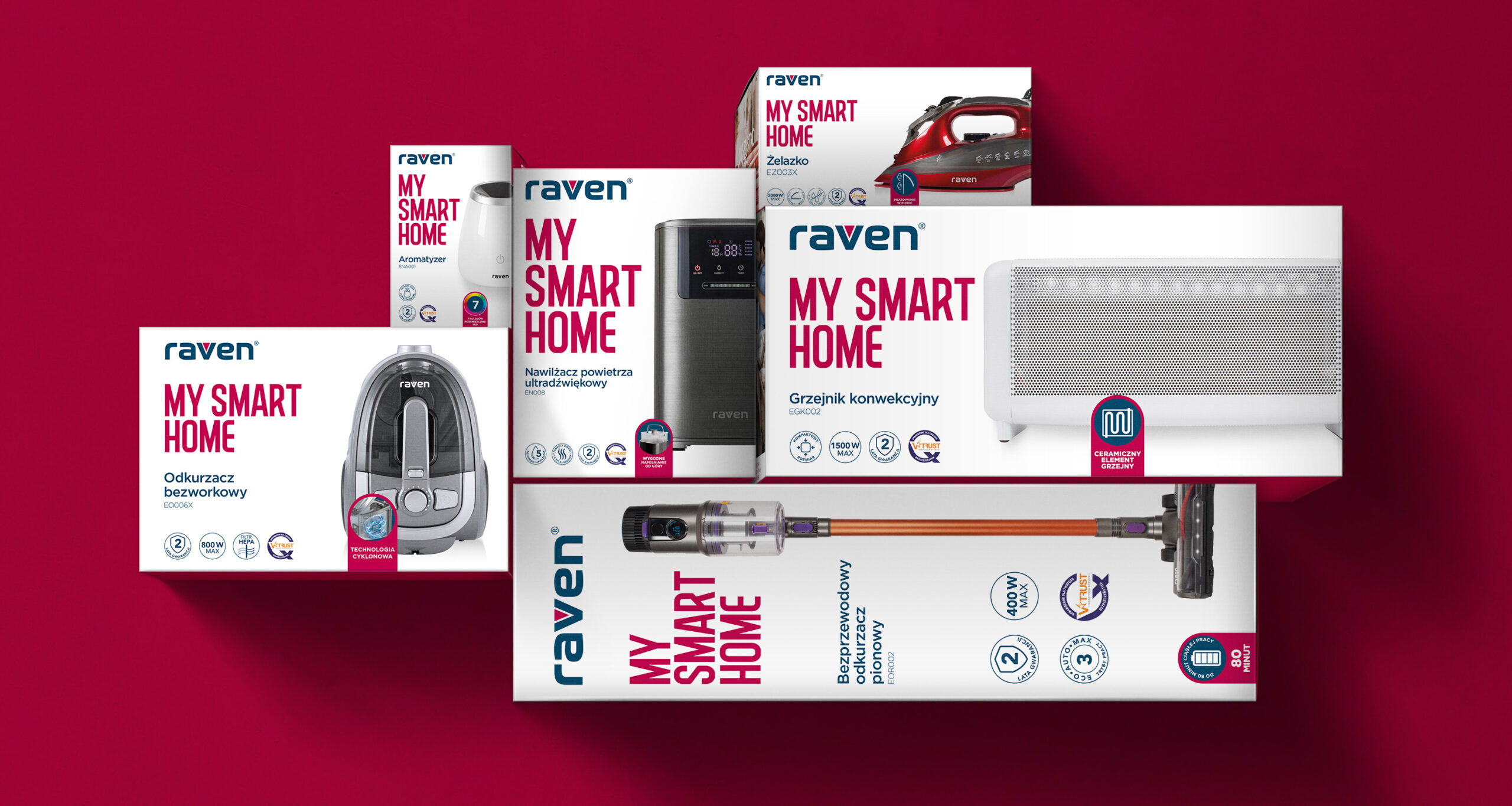
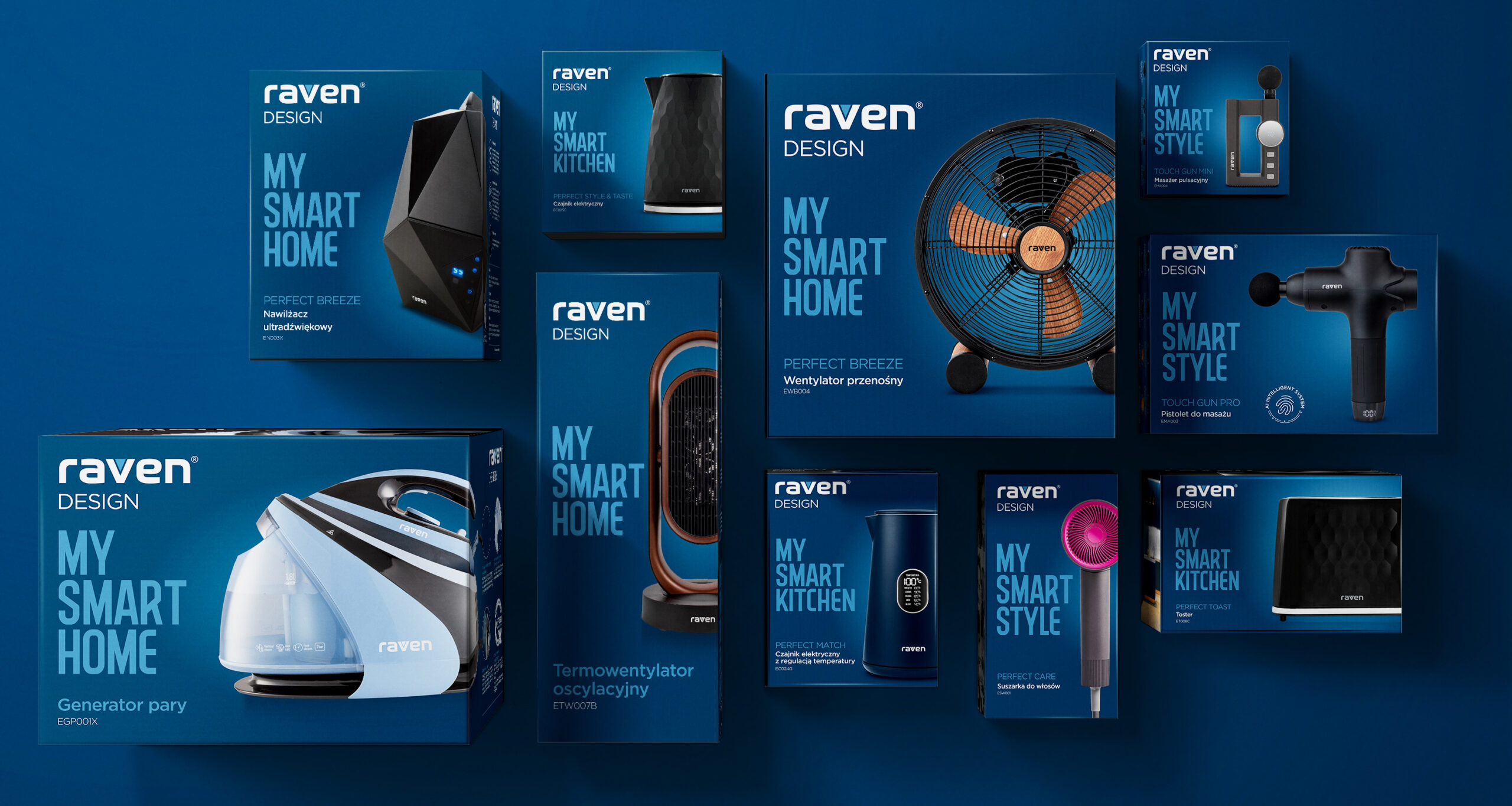
From the outset, we approached packaging as an active tool that had to fulfil the functions we defined – it has to inform about the product and its most important features, it has to inspire, educate and also carry the brand image. We divided the entire portfolio into categories (Kitchen, Home, Style, Design) and the corresponding colour codes and slogan. Each of the walls of the packaging was given a dedicated function, which makes it quick and easy to find the information you need. We applied this system to all products, regardless of shape and size.
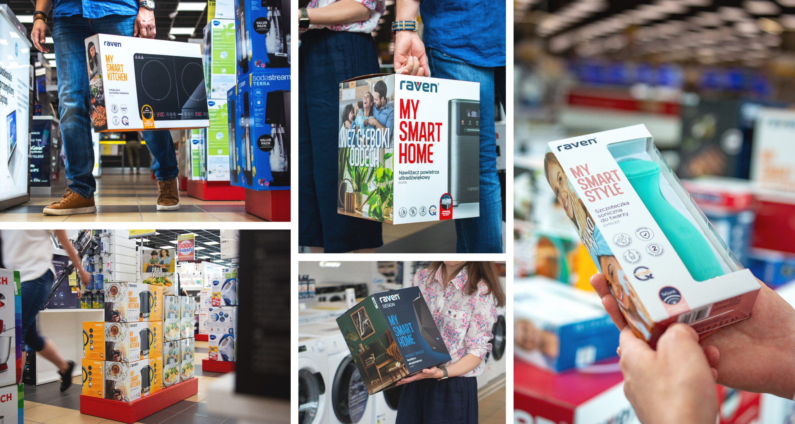
An interesting challenge for us was how to display products in the shop space, where it is common for groups of products to be arranged in so-called ‘islands’. With this in mind, we structured the design of the packaging so that, by linking the sides together, we could create an even larger, coherent display area highlighting the product and its benefits.
The Raven brand has completely changed its face. It exudes optimism, brightness and colour. The packaging has become attractive and friendly, and the offer clear and transparent. We have re-created a brand that inspires action, is modern and, above all, competitive in the marketplace. Big challenges, big expectations, big portfolio – one clever solution!
