Soplica przepalana. Design throwback to the past.
Visual identity / Packaging / Portfolio / Communication
Soplica is a hugely popular brand on the Polish market. A large portfolio of strong spirits satisfies nearly every taste and need. Is there still room for novelty among so many variants? It turns out there is. Soplica has entrusted us with the creation of a new line, so different from the existing ones…
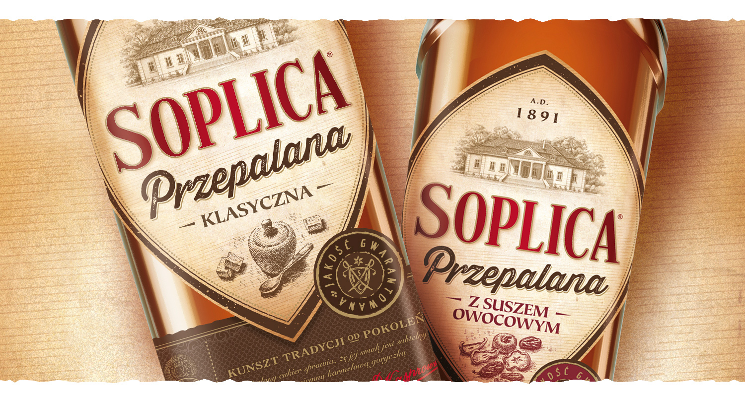
Our task was to develop a complex design of a new product line – Soplica Przepalana. It is a spirit inspired by old, traditional recipes dating back to the 18th century. The secret to theflavor of burned vodkas was the proper burning of sugar. And exactly this process had to be emphasized on the packaging.
Strategically, we preserved the DNA of the Soplica brand – the distinctive shape, typography and icons. But beyond that, we changed everything. We designed unique, vibrant packaging that communicates authenticity and classic origin. The color scheme, texture, typography used and original handmade engravings capture the spirit of the times and put the consumer in the mood of 17th century. Our work on Soplica Przepalana was not limited to packaging. We created a stylized key visual that complements the story and tells about the tradition and its unique recipe. The flexibility of the illustrations allows them to be used on different platforms of communications and in any layout. This gave the new Soplica line a complete, authentic and distinctive visual identity.