Xenna. Redesign of an icon.
Redesign / Visual identity / Packaging / Portfolio
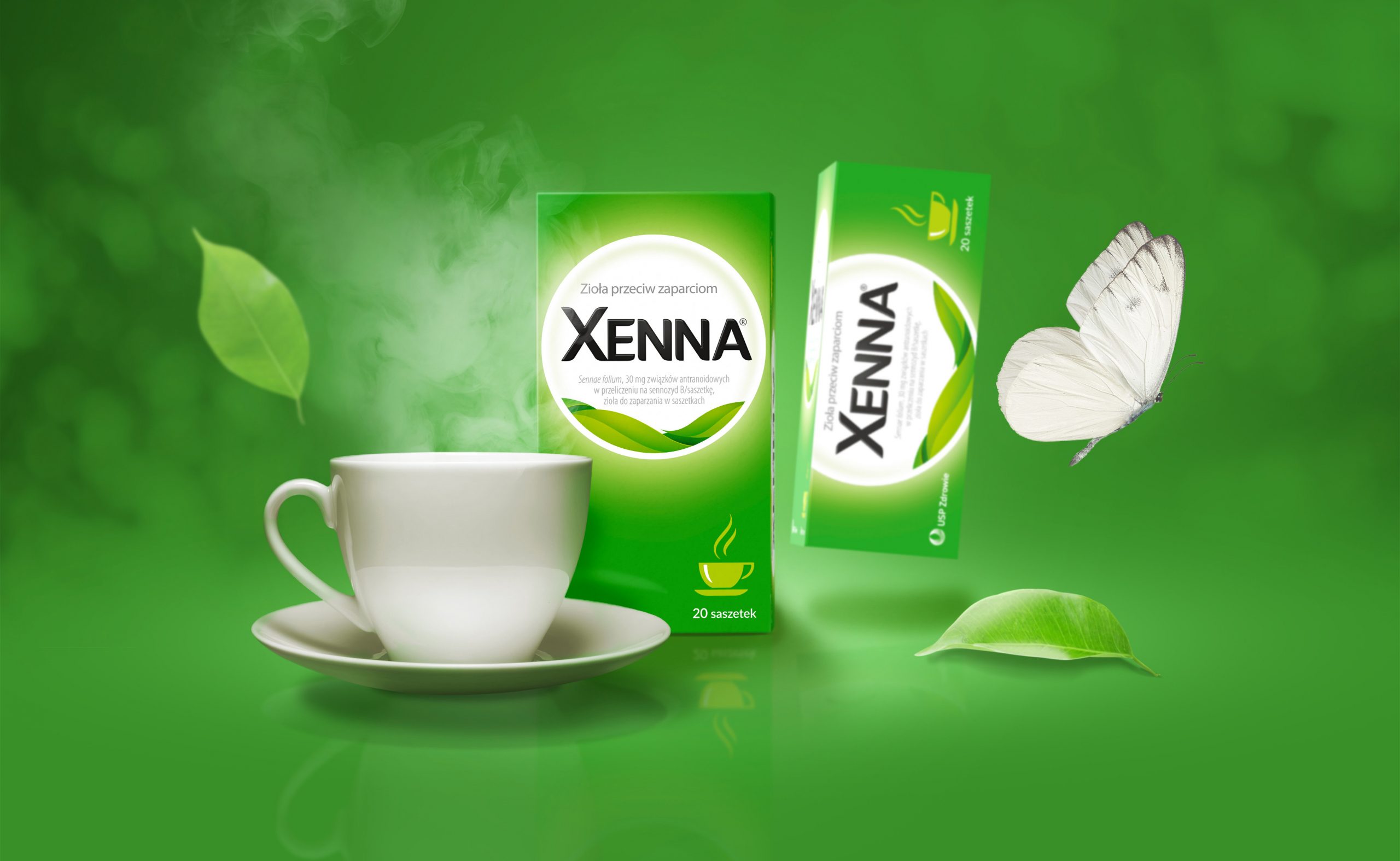
Xenna Extra is the absolute leader in the category of constipation medicines. For years, it has enjoyed the trust of consumers. Xenna is an iconic brand. And redesigning the packaging of well-known and popular brands is never easy. On the one hand, we need to reach new, younger group of consumers, on the other hand, maintain loyal customers and shelf recognition. The effect is a modern, light and easily readable packaging. We combined a new, strong brand asset with a familiar color code. We implemented a clear hierarchy of information with modern typography. In addition, we have a modern interpretation of the plant motif and a bright, simple composition. The brand’s packaging has become consistent, recognizable and legible.