Zott Superfoods/Protein. Design on the plus side.
Visual identity / Typography / Packaging / Portfolio / Communication
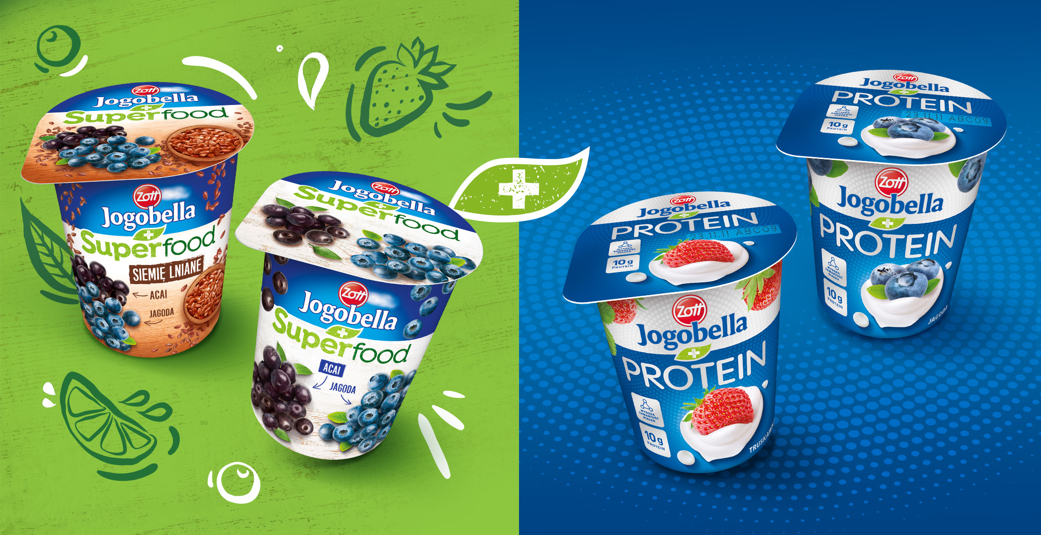
We like to design tasty, fruity packaging. Despite changing trends, seeing attractive fruit on mainstream packaging is still the best option when we want to highlight flavor, juiciness or natural origin. Zott has been entrusting us with fruit designs for years, and this time was no different. In addition, the task required us to take a strategic approach to the entire portfolio of the new line.
Our task was to skillfully combine the Jogobella brand with the functional Superfoods and Protein variants. It is important that the packaging uses familiar category codes and allows flexible portfolio development.
We started by building a portfolio strategy and developing a coherent layout system. We decided to divide the packaging into two parts. In the upper one we placed the Jogobella logo, which in this case becomes an endorsement. Below we have a subbrand name and a beauty shot. We connected the whole with the “Plus” symbol enclosed in a leaf (naturalness, authenticity). We have preserved Jogobella color coding, but at the same time, we developed a new, customized approach to the product visualisation. We created the typography, appetizers, and finally, we took care of the brand communication.